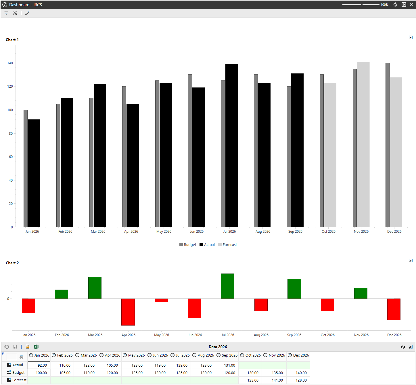
Can OneStream produce a clean, IBCS-style Actual, Budget, and Forecast chart without sending the data to another reporting tool? Challenge accepted, using nothing but a tidy Cube View, two adapters, and a small Dashboard DataSet business rule that takes control of the series formatting.
Step 1: Prepare chart-friendly Cube Views
Create a source Cube View with twelve columns, M1 to M12, using time filters such as T#|WFYear|M1. Add three rows in this order: Actual, Budget and Forecast.
In this example, Actual is shown for M1–M9 and Forecast for M10–M12. Column overrides point the unused Actual and Forecast periods, leaving only the relevant series visible. Make the cut-off dynamic using your workflow or current-period logic. Budget remains populated across the year.
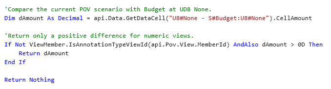
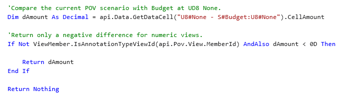
For the variance chart, create a second Cube View with two rows: POS and NEG. The supplied workspace calls U8#IBCS_POS and U8#IBCS_NEG. Configure those calculated members to split current Scenario minus Budget: POS returns only positive values and NEG only negative values.

Step 2: Add the adapter chain
Each chart uses two adapters. A Cube View adapter reads the source data: dat_IBCS_Chart1_Source or dat_IBCS_Chart2_Source. A Method adapter then calls the workspace Dashboard DataSet rule and returns IBCS_Chart1 or IBCS_Chart2.
Think of the flow as: Cube View → source adapter → business rule → method adapter → chart. Keeping the numbers in Cube Views makes the solution easy to test; keeping the presentation logic in the rule makes it flexible.


Step 3: Create the IBCS-style series
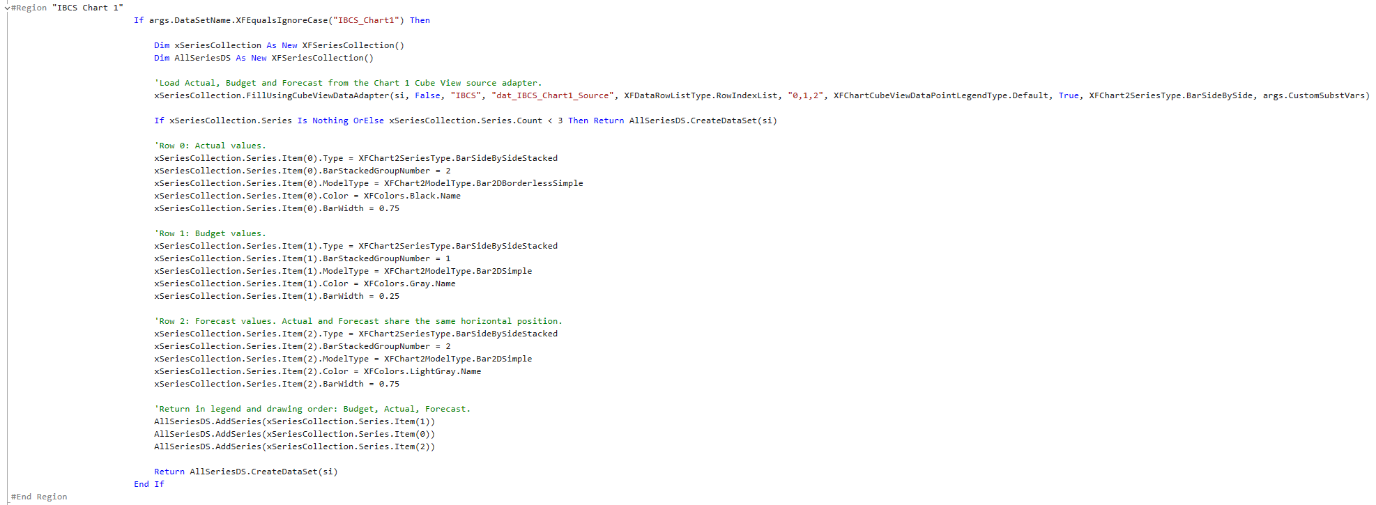
For Chart 1, the rule loads rows 0, 1 and 2 with FillUsingCubeViewDataAdapter. It then styles the series:
- Actual: black, width 0.75, stacked group 2.
- Budget: grey, width 0.25, stacked group 1.
- Forecast: light grey, width 0.75, stacked group 2.
Actual and Forecast share group 2, so they occupy the same horizontal position but appear in different months. The narrow Budget bar sits beside them like a plan marker. Finally, add the series in Budget, Actual, Forecast order to control both drawing and legend order.
Step 4: Turn variance into a signal
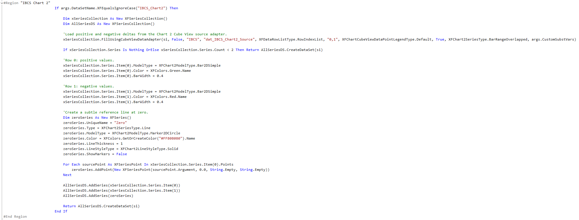
Chart 2 loads POS and NEG as overlapping range bars. Set POS to green and NEG to red, both with width 0.4. Then create a third XFSeries of type Line, add one zero-valued point for every month, colour it subtle grey and switch markers off. That gives the variance strip a clean reference baseline.
Step 5: Remove the chart clutter
Create two Advanced Chart components with Series Source Type set to Business Rule and bind them to the Method adapters. Turn off borders, animations and gridlines. Keep the legend on for Chart 1 and off for Chart 2. Stack both charts above the supporting Cube View in a Grid dashboard.
That is the whole trick: Cube Views decide what the numbers mean; the Dashboard DataSet rule decides how they speak. The result is compact, readable and pleasantly close to IBCS notation, inside OneStream. Challenge completed.
Do you have questions on this process or do you have other questions on OneStream, feel free to reach out!
.webp)