With so much data within businesses these days, it’s easy to get overwhelmed on where to focus and how to organize it. A well-designed Excel dashboard turns raw figures into clear, interactive insights that drive smarter decisions. Dashboards allow you to move beyond static spreadsheets and present information in a way that’s both visual and actionable. This article walks you through the essentials of setting up dashboards in Excel from data preparation to visualization and design.
What Makes a Good Dashboard
The best dashboards have three things in common:
- Clarity – Focus on the few KPIs that matter to your target audience.
- Interactivity – Allow users to explore data with slicers, filters, and timelines.
- Storytelling – Organize visuals in a way that leads the reader from big picture to detail.
A good dashboard will lead the viewer to an opinion about the data, rather than showing them as many numbers as possible.
Step 1: Prepare Your Data
Clean, structured data is the foundation of any dashboard. Use Excel tables or Power Query to standardize inputs from different sources. A good practice is to organize your data within one or more hidden sheets within excel, which are labeled clearly for end users and future editors of the dashboard. You should avoid copy-pasting data into these sheets and automate this as much as possible, to avoid additional work and human-error.
Step 2: Build Visuals
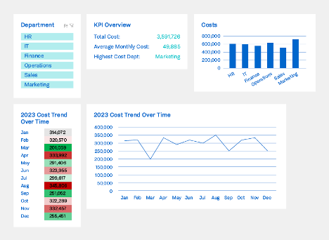
Once the data is ready, bring it to life with visuals tailored to your audience. Here are 5 examples of visuals and how they can be used within your dashboard:
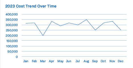
- Line charts – Show trends over time for quick pattern spotting
- Bar & column charts – Compare categories side by side clearly
- Bullet charts – Track progress against a target in a compact way
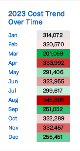
- Heat maps – Highlight highs and lows in large tables with color
- Sparklines – Display tiny, in-cell trends without taking space
The right chart makes the insight instantly obvious, allowing you to get your point across.
Step 3: Add Interactivity
Great dashboards let users choose their focus areas without touching formulas. In Excel, this means
- Slicers & timelines - Filter data by department, region, or period with one click.
- Dropdowns & form controls - Switch between KPIs or test ''What-if'' scenarios.
For example, you might add region filter for an HR dashboard or model the impact of different revenue growth assumptions.
Step 4: Design for Impact
A dashboard is as much about layout as content. Keep it clean so that users don’t get overwhelmed with data and the purpose is clear:
- Use a 1-page design with no more than 3-4 main sections.
- Apply a consistent color scheme (e.g., green for positive, red for negative).
- Leave white space to avoid clutter and guide the eye naturally.
Think of your dashboard from the end-user perspective. Only keep the information that is absolutely necessary for them, and make your intended purpose clear.
Best Practices & Pitfalls
Do’s:
- Define KPIs with your audience in mind.
- Automate data refresh wherever possible.
- Stick to simple, effective visuals.
Don’ts:
- Overload with too many charts.
- Use flashy 3D graphs (they distort numbers).
- Rely on manual updates (they can lead to human errors).
Conclusion
Excel dashboards give your teams the ability to turn static reports into dynamic stories. They save time, improve accuracy, and make analysis accessible to decision-makers. Start with the absolute most important information and expand from there when needed.
While Excel is not specifically built for creating dashboards, its flexibility and common use within businesses makes it a great starting point for some basic dashboards.
